The CallGuide Bootstrap Forms Editor is integrated into the rostrvm File Editor and enables CallGuide Bootstrap Forms as used by the Web Advisor to be designed graphically without the need to edit HTML directly. It provides a drag and drop editor allowing Bootstrap styled web pages to be built from a set of predefined components defined in a toolbox.
The following sections describe:
| • | how to start the editor and select a file for editing; |
| • | how to create the layout; |
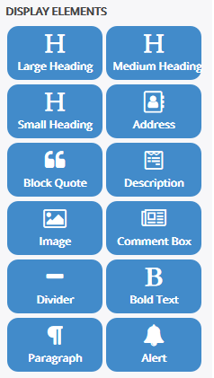
| • | Display Elements ... Headings Divider Address Block Quotes Description Image Comment Box Bold Text Paragraph Alert |
To start the editor, from Manager select File Editor from the user menu. Note that if this is the first time the file editor has been run then it is downloaded from the rostrvm server - this may take a short time.
The Bootstrap Forms Editor may now be invoked from the File Editor by selecting a bootstrap page from the Advisor Profile CallGuide Filing System under DEFAULT, GROUP or USER (not Templates - this cannot be changed). A new page can be created by selecting New from the drop-down File menu, or clicking the New button from the toolbar. In this case a number of templates are presented from which you can choose. Clicking the Create button creates a new form:
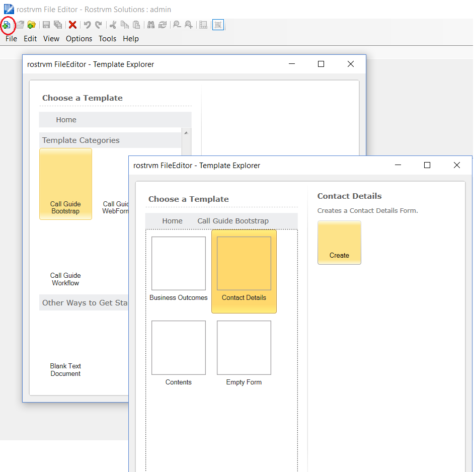
You can now edit the new form by clicking on the name from the File Viewer (contact-details1.htm in this example). The file is opened in the Forms Editor in the left hand pane.
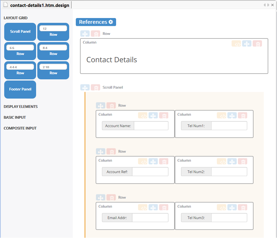
The editor consists of a toolbox, layout canvas and property edit dialog. The toolbox contains a number of predefined components that can be dragged and dropped onto the layout canvas to build the Bootstrap styled web form. The toolbox components are split between 4 categories. The categories are Layout Grid, Display Elements, Basic Input and Composite Input. The Layout Grid contains components that allow the forms layout to be specified in terms of a row and column grid system. The remaining categories define Bootstrap styled element components that form column content.
Layout Grid Toolbox
The Layout Grid system contains components used for creating page layouts through a series of rows and columns that contain content. Each row in the grid system contains 12 units that are divided between up to 12 columns. For example, a row could consists of 2 columns each with 6 units. Each of the columns scales as the device or viewport size increases or decreases.
The Layout Grid system category contains 5 default row configurations: 1 column (12 units), 2 columns (6 units, 6 units), 2 columns (8 units, 4 units), 3 columns (4 units, 4 units, 4 units) and 2 columns (2 units, 10 units).
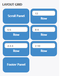
Each layout grid row configuration may be customised by entering a new set of values. The column/unit combination must total 12. If an invalid grid layout row configuration is entered an error highlight is shown when the entry box loses focus. If a layout grid row item is in an error state it cannot be dragged onto the design canvas.
The layout grid category contains a Scroll Panel component that implements a scrollable container which may contain other rows. The Scroll Panel automatically sizes itself so that the bottom of the Scroll Panel is pinned to the bottom of the window when displayed by CallGuide. Only one Scroll Panel is allowed per page and only a Footer Panel is allowed below the Scroll Panel.
The Footer Panel defines a single column row that is docked to the bottom of the window when displayed by CallGuide. Only one Footer Panel is allowed per page.
7.2.2.1.7.
The standard CallGuide web form layout has a single column row containing the page header. A Scroll Panel below the header contain further rows with content.
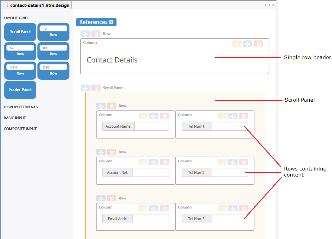
If the content of the Scroll Panel exceeds the view port of the Scroll Panel, vertical scrollbars will appear when displayed by CallGuide.
References
Custom javascript and stylesheet files can be referenced by clicking the References button at the top left of the canvas.
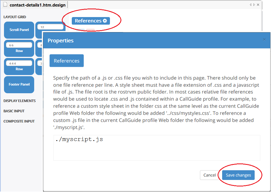
Type in the name of the custom file and click the Save changes button to apply.
Canvas
As each component is dragged from the toolbox to the canvas a dashed rectangular outline indicates the component’s insert position if dropped. As the component is dragged around the canvas, the insert position will move.
A row can be dropped inside another column. In general each column should only contained one element or row component. Multiple element components may be dropped inside a single column but their layout within the column may be unpredictable when the page is sized.
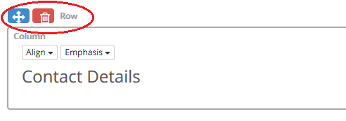
An existing row can be moved to a new canvas position by dragging the move row handle. An existing row can be deleted by clicking the delete row button.
The contents of a column may be moved to a new column by dragging the move column contents drag handle. The column contents can be deleted by clicking the delete column contents button.
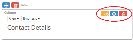
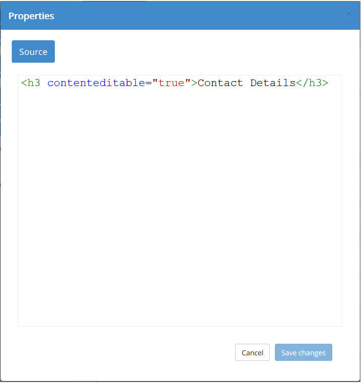
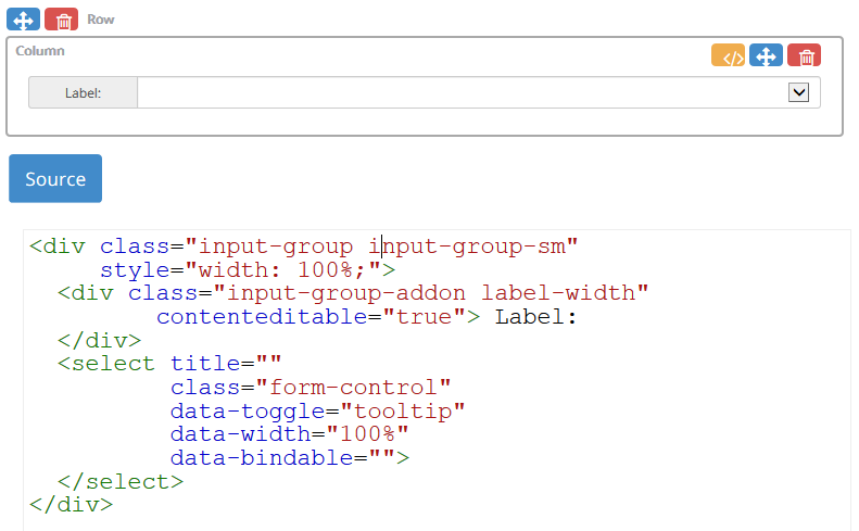
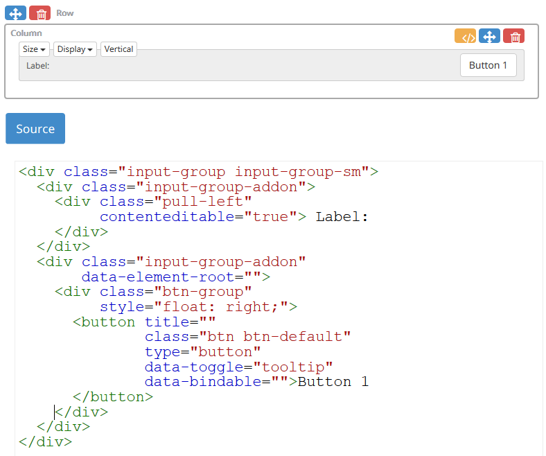
Clicking the edit source button shows the HTML source code for this column content.
The editor provides a preview mode where the toolbox, canvas row and column placeholders can be hidden to show how the page would look when displayed in CallGuide. Preview mode is selected from the FileEditor toolbar button.
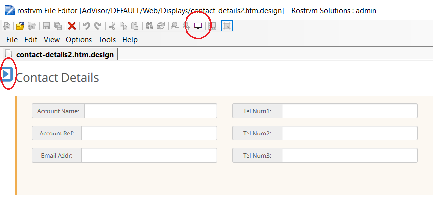
Preview mode is cancelled by selected the Cancel Preview Mode button displayed at the top left of the canvas, or by pressing the Select Preview Mode button again.
The Display Elements toolbox category contains non-input display elements. This category contains the following elements: Large Heading, Medium Heading, Small Heading, Address, Block Quote, Description, Image Comment Box, Divider, Bold Text, Paragraph and Alert. All the display elements are Bootstrap themed.
All text components in this category once dropped onto the canvas can have their text changed by selecting the component to give it focus then edit the text in-place on the canvas.
Bound to CLIPboard
All text components in this category once dropped onto the canvas can be bound to either rostrvm CLIPboard elements or CallGuide Persistant elements. The binding for these components is one way from CallGuide to the text component.
To bind a text field to rostrvm CLIPboard, the name of the CLIPboard element is specified inside a set of {{ }} markers. For example to bind +AccountName to a Heading component:
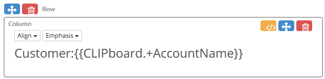
The bound CLIPboard element must be registered in the callguide.custom.js file. This would be done with a AddCLIPElement("+AccountName") inside the Initialise() function.
Changes to a bound CLIPboard element value are automatically refreshed on the bound web page.
Bound to CallGuide Persist
To bind a text field to a CallGuide Persist element, the name of the Persistant element is specified inside a set of {{ }} markers. For example to bind the field username contained in the data source mydatasrc to a Heading component:
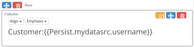
The Persist element must be registered in the callguide.custom.js file. This would be done with a AddPersistElement ("mydatasrc.username") inside the Initialise() function.
Changes to a bound Persist element value are automatically refreshed on the bound web page.
Large
The Large Heading component uses an h1 element.
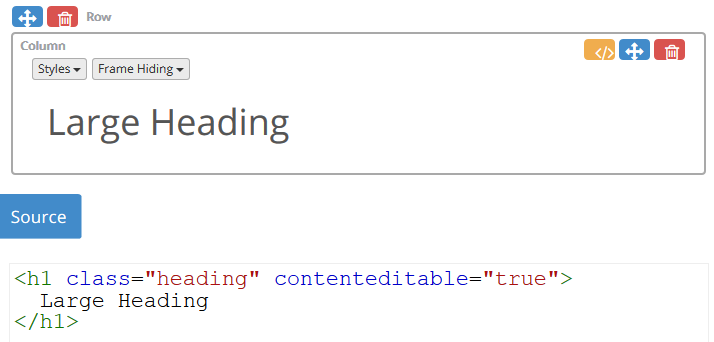
The Heading component once dropped on the canvas supports property helpers that appear when the cursor hovers over a Heading component. The property helpers apply Bootstrap classes that alter the look of the UI element.
Styles
Sets the background colour (Dropdown options: Default, Primary, Success, Info, Warning and Danger).
Frame Hiding
When enabled, Advisor shows a hide window button on the right of the heading. When pressed, Advisor hides the window. A show window button is displayed at the boundary of the hidden window allowing the window to be shown again. (Dropdown options: Disabled, Enabled).
Medium
As for Large Heading, except references an <h3> element.
Small
As for Large Heading, except references an <h5> element.
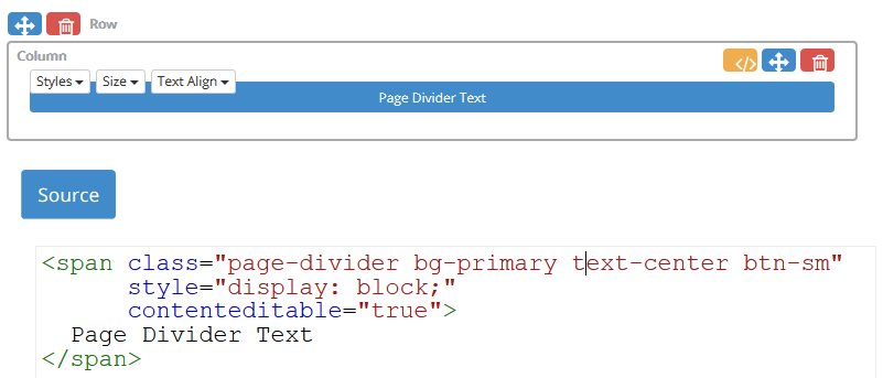
The Divider component contains a span with centre aligned text with a Bootstrap primary background colour.
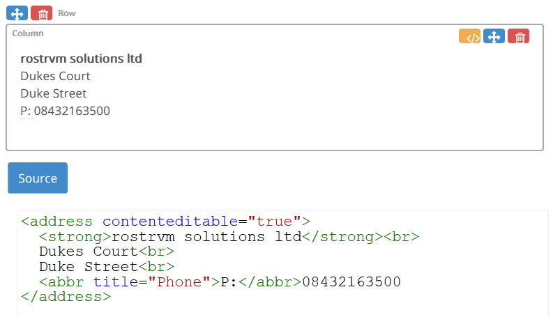
The Address component presents contact information, it preserves formatting by ending all lines with <br>.
The Block Quotes component is useful for quoting blocks of content from another source within the document.
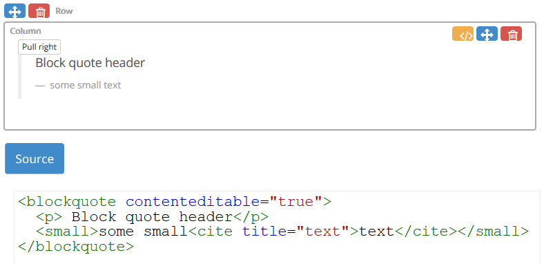
The Block Quotes component once dropped onto the canvas supports property helpers that appear when the cursor hovers over a Block Quotes component. The property helpers set Bootstrap classes that alter the look of the component.
Pull right
Floats the element to the right.
The Description component is a list of terms with their associated descriptions.
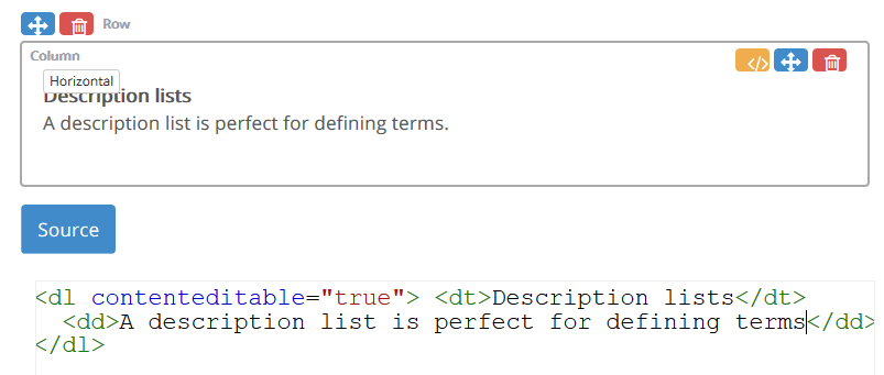
The Description component supports property helpers that appear when the cursor hovers over a Description component. The property helpers set Bootstrap classes that alter the look of the component.
Horizontal
Make terms and descriptions in <dl> line up side-by-side.
The Image component is an image container. The src attribute location is made relative to the CallGuide profile ‘Display’ folder.
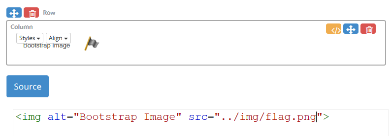
The Image component once dropped onto the canvas supports property helpers that appear when the cursor hovers over an Image component. The property helpers set Bootstrap classes that alter the look of the component.
Styles
Set image shapes (Dropdown options: Default, Rounded, Circle and Thumbnail).
Align
Set image alignment (Dropdown options: Default: Centre).
The Comment Box is a lightweight, flexible component to showcase key content on a page.
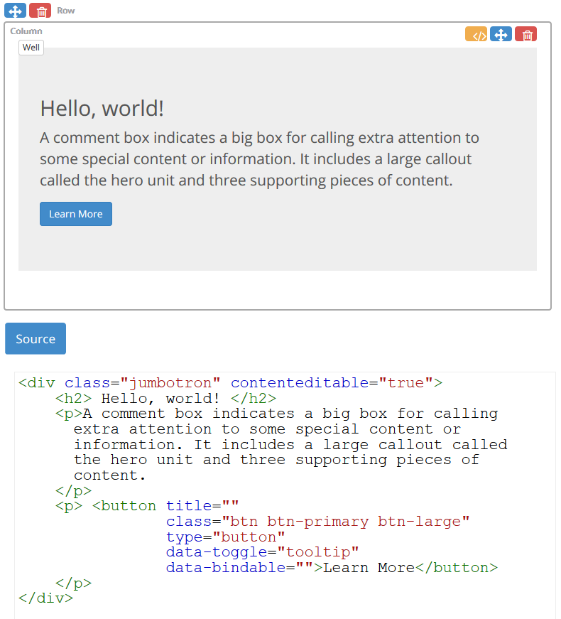
The Comment Box component supports property helpers that appear when the cursor hovers over a Comment Box component. The property helpers set Bootstrap classes that alter the look of the component.
Well
Gives the Comment Box component an inset effect.
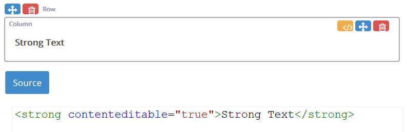
The Bold Text component displays text using a bold font.
The Paragraph component represents a block of text that is separate from adjacent blocks by vertical blank space.
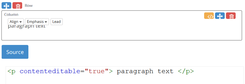
The Paragraph component supports property helpers that appear when the cursor hovers over a Paragraph. The property helpers set Bootstrap classes that alter the look of the component.
Align
Set text alignment (Dropdown options: Left(default), Center, Right).
Emphasis
Set the text foreground colour emphasis (Default, Muted, Primary, Success, Info, Warning, Danger)
Lead
Make the paragraph stand out.
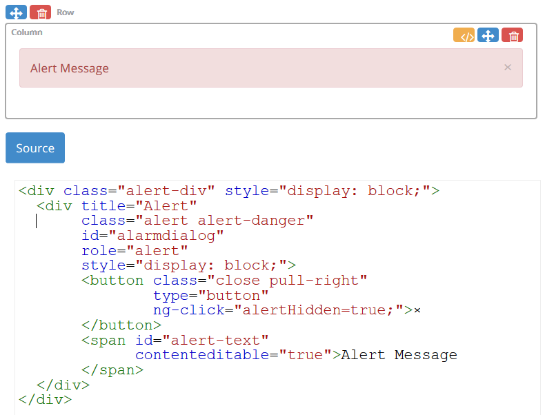
The Alert component provides contextual feedback message for typical user actions.
The Basic Input toolbox category contains single form input components that can be combined with a left-hand or right-hand label. This category includes a Date, Time, Input, CheckBox Group, Radio Group, Select, Button, Text Area and Label. All the components are Bootstrap themed.
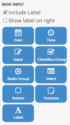
If the Include Label checkbox is selected, a left-hand label will be combined with the component. Selecting Show label on the right will show the component label on the right-hand side.
The text for each Label can be edited in-place by clicking on the label text.
The Date component is a text element that displays a popup calendar when clicked. The selected date is shown in the associated text element. After a date is selected the popup will close. The date text element is read only. The selected date may be removed by clicking in the field and hitting the DEL key.
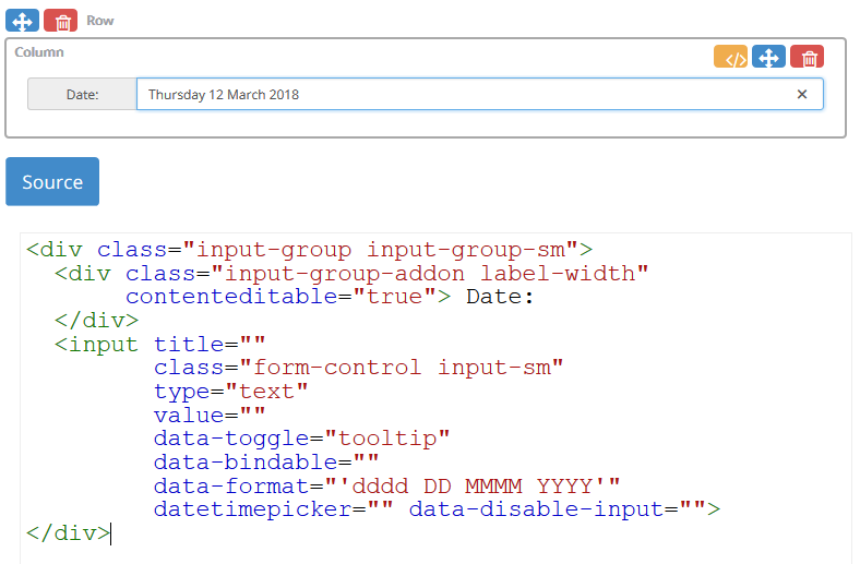
Attributes
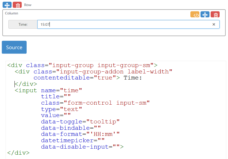
To modify the Date component attributes click the edit source button. The following attributes can be changed as required:
| • | data-format : Specifies the display format of the date text area. It will accept any valid date string as defined by the JavaScript library moment.js (see https://momentjs.com/). |
| • | min-date : Specifies the minimum date that can be selected by the popup calendar. The attribute value is defined as a moment.js date. For example to set the minimum date of 25-03-2017, specify the attribute as min-date=“moment(‘2017-03-25’)” |
| • | max-date : Specifies the maximum date that can be selected by the popup calendar. The attribute value is defined as a moment.js date. For example to set the maximum date of 25-05-2017, specify the attribute as max-date=“moment(‘2017-05-25’)” |
| • | days-of-week-disabled : Disable days in a week from selection. Days run from Sun: 0, Mon: 1, Tue: 2, Wed: 3, Thu: 4, Fri: 5, Sat: 6. So to disable the weekend specify days-of-week-disabled="[0,6]" |
| • | disabled-dates : Disable a list of dates: disabled-dates="[moment('2017-04-02'), '2017-04-30']" |
Properties
Hovering the cursor over a Date component will display tooltip text describing the element type and format. To edit the properties click the tooltip text.
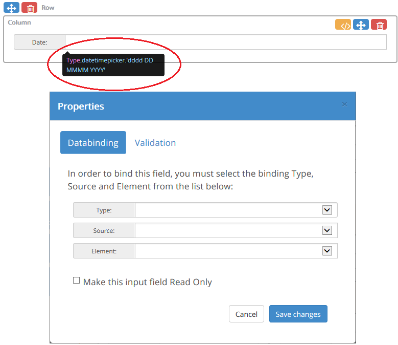
The property dialog is displayed.
Databinding Tab
| • | Type - allows the date value to be bound to a rostrvm CLIPboard element, a CallGuide Persistant data source element or to Business Outcome data. |
| • | Source - the source of the bound data (e.g. a data store name for CLIPboard binding); |
| • | Element - the name of the element (e.g. CLIPboard element name, business outcome); |
| • | Make this input field Read Only - provides the option to make this text field read only. |
Validation Tab
| • | Required - allows the field to be specified as being required. A required field must contain a value in order for a CallGuide script to move forward or to be able to navigate away from the page; |
| • | Description - allows the field hover help text to be defined. |
The Time component displays a popup time selector when clicked. The selected time is shown in the associated text element. To close the time popup click away from the popup. The time text element is read only. The selected time may be removed by clicking in the field and hitting the DEL key.
Properties
Hovering the cursor over a Time component will display tooltip text describing the element type and format. To edit the properties click the tooltip text.
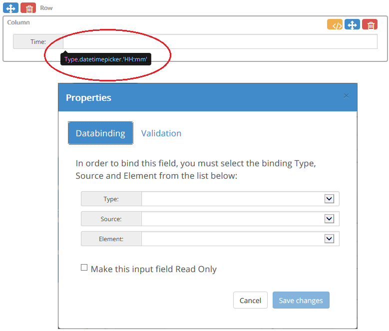
The property dialog is displayed.
Databinding Tab
| • | Type - allows the time value to be bound to a rostrvm CLIPboard element, a CallGuide Persistant data source element or to Business Outcome data. |
| • | Source - the source of the bound data (e.g. a data store name for CLIPboard binding); |
| • | Element - the name of the element (e.g. CLIPboard element name, business outcome); |
| • | Make this input field Read Only - provides the option to make this text field read only. |
Validation Tab
| • | Required - allows the field to be specified as being required. A required field must contain a value in order for a CallGuide script to move forward or to be able to navigate away from the page; |
| • | Description - allows the field hover help text to be defined. |
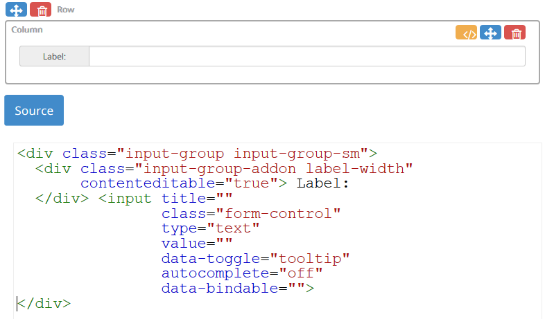
The Input component consists of a read/write input text.
Properties
Hovering the cursor over a Input component will display tooltip text describing the element type. To edit the properties click the tooltip text.
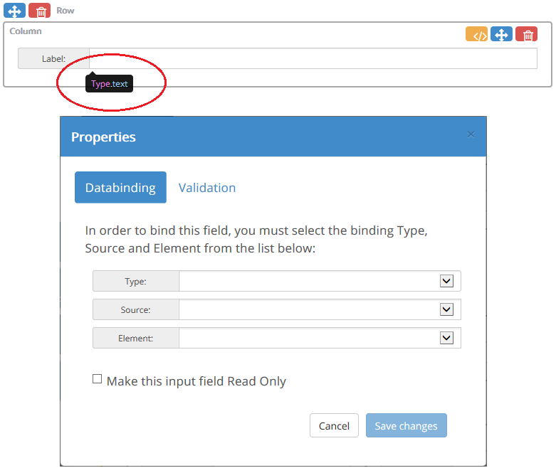
The property dialog is displayed.
Databinding Tab
| • | Type - allows the input value to be bound to a rostrvm CLIPboard element, a CallGuide Persistant data source element or to Business Outcome data. |
| • | Source - the source of the bound data (e.g. a data store name for CLIPboard binding); |
| • | Element - the name of the element (e.g. CLIPboard element name, business outcome); |
| • | Make this input field Read Only - provides the option to make this text field read only. |
Validation Tab
| • | Type - <Text, Password, Email, Number, Url> - specifies the type of validation that is performed. |
| • | Required - <Yes, No> - specifies whether the field is mandatory. |
| • | Pattern - <Regular Expression> - specifies a valid pattern using a regular expression. (Only available for Type=Text). |
| • | Description - allows the field hover help text to be defined. |
If an Input component fails its validation it will not be possible to move forward or backward in a CallGuide script or navigate away from the html page. CallGuide will highlight the field to show it has failed validation
The Check Group component displays a configurable group of Checkboxes.
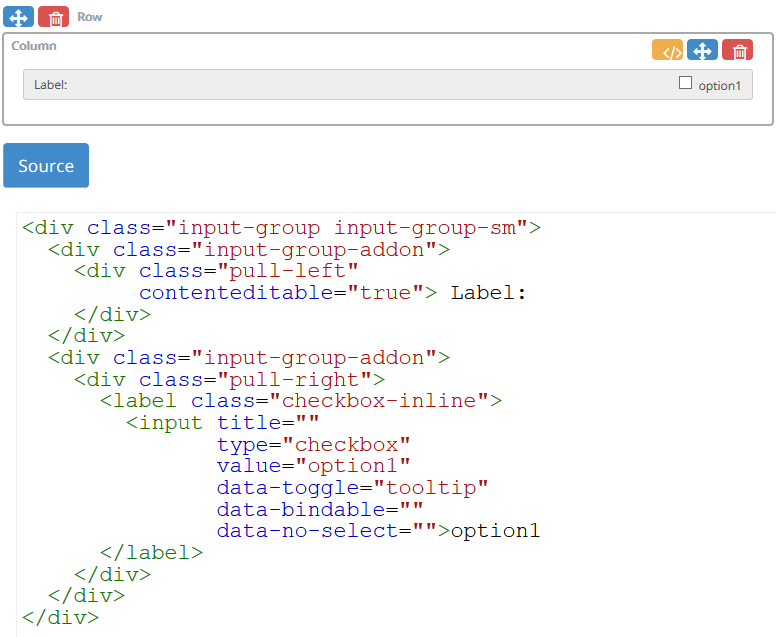
Properties
Hovering the cursor over a Checkbox group component will display tooltip text describing the element type. To edit the properties click the tooltip text.
The property dialog is displayed.
Databinding Tab
| • | Type - allows the checkbox value to be bound to a rostrvm CLIPboard element, a CallGuide Persistant data source element or to Business Outcome data. When a bound Checkbox is checked the value written to the bound data source is a string value of 1 and 0 when unchecked; |
| • | Source - the source of the bound data (e.g. a data store name for CLIPboard binding); |
| • | Element - the name of the element (e.g. CLIPboard element name, business outcome). |
Choices Tab
This tab allows a group of Checkboxes to be configured through the Edit Choice dialog. From here you can:
| • | Add new Checkbox - this displays the Edit Choice editor allowing a new Checkbox name and selected property to be entered. |
| • | Edit selected Checkbox; |
| • | Delete selected; |
| • | Move selected Checkbox up; |
| • | Move selected Checkbox down. |
Validation Tab
| • | Required - allows the field to be specified as being required. A required field must contain a value in order for a CallGuide script to move forward or to be able to navigate away from the page; |
| • | Description - allows the field hover help text to be defined. |
The Databinding and Validation tabs displayed by the property edit dialog for a given Checkbox apply to that selected Checkbox only.
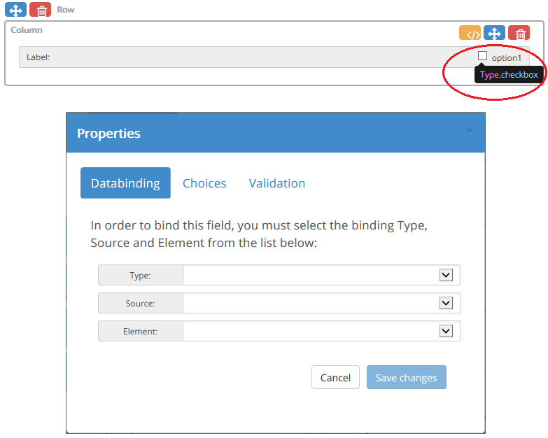
The Radio Group displays a configurable group of Radio buttons.
Properties
Hovering the cursor over a Radio group component will display tooltip text describing the element type. To edit the properties click the tooltip text.
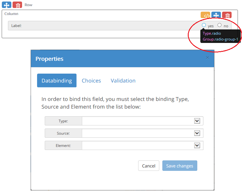
The property dialog is displayed.
Databinding Tab
| • | Type - allows the radio button value to be bound to a rostrvm CLIPboard element, a CallGuide Persistant data source element or to Business Outcome data; |
| • | Source - the source of the bound data (e.g. a data store name for CLIPboard binding); |
| • | Element - the name of the element (e.g. CLIPboard element name, business outcome). |
Choices Tab
This tab allows multiple Radio buttons to be configured through the Edit Choice dialog. From here you can:
| • | Group - radio buttons that belong to a group have a common name. A group name is automatically assigned to a default Radio group when it is first dropped onto the canvas. The group name may be changed by entering a new one here; |
| • | Add new Radio - this displays the Edit Choice editor allowing a new Radio button name and selected property to be entered. Each Radio group initially contains two Radio buttons when dropped onto the canvas. The default Radio buttons have initial names of yes and no with values yes and no. |
| • | Edit selected entry; |
| • | Delete selected; |
| • | Move selected entry up; |
| • | Move selected entry down. |
Validation Tab
| • | Required - allows the field to be specified as being required. A required field must contain a value in order for a CallGuide script to move forward or to be able to navigate away from the page; |
| • | Description - allows the field hover help text to be defined. |
The Databinding and Validation properties for a given Radio button will be applied to all Radio buttons in that group.
The Select component consists of a select element.
Properties
Hovering the cursor over a Select component will display tooltip text describing the element type. To edit the properties click the tooltip text.
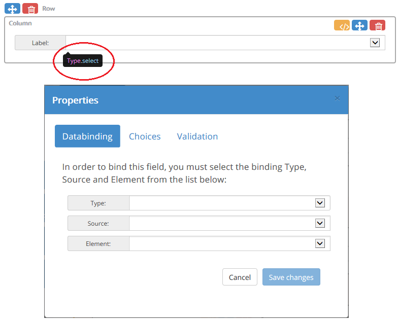
The property dialog is displayed.
Databinding Tab
| • | Type - allows the select value to be bound to a rostrvm CLIPboard element, a CallGuide Persistant data source element or to Business Outcome data; |
| • | Source - the source of the bound data (e.g. a data store name for CLIPboard binding); |
| • | Element - the name of the element (e.g. CLIPboard element name, business outcome). |
Choices Tab
This tab allows multiple choices to be configured through the Edit Choice dialog. From here you can:
| • | Choice source - where the entered choices are stored. The choices can be stored in the HTML Page, the rostrvm database or in a CallGuide persistant store; |
| • | Add new choice. This displays the Edit Choice editor allowing the new choice’s name, selected and value to be entered; |
| • | Edit selected choice; |
| • | Delete selected; |
| • | Move selected choice up; |
| • | Move selected choice down. |
Validation Tab
| • | Required - allows the field to be specified as being required. A required field must contain a value in order for a CallGuide script to move forward or to be able to navigate away from the page; |
| • | Description - allows the field hover help text to be defined. |
Choice source
Selecting rostrvm Database for the Choice source displays a Group selection box. An existing group of choices may be selected from the Group drop-down. If an existing group is selected, the choices defined in that group are shown in the Choices list. A new Group may be entered to create a new group. New choices may then be added to the new group.
Selecting CallGuide for the choice source displays a Group selection box. The name entered here is a CallGuide persistant data source name. A choice list may be defined in CallGuide and once assigned to the persistant data source will be displayed by the Select component.
A CallGuide persistant data source is defined in the callguide.custom.js file. The data source must be tagged as permanent so not to be deleted at the beginning of a new call. The example below shows how to create persistant data source called “session”.
PersisData_UpdateEx(“session”,
[{
‘label’: ‘morning’,
‘value’: ‘morning’,
‘selected’: 0
},
{
‘label’: ‘afternoon’,
‘value’: ‘afternoon’,
‘selected’: 0
}]);
PersisData_SetPermanent(“session”, true);
The Button component consists of a button element.
Properties
Hovering the cursor over a Button component will display tooltip text describing the element type. To edit the properties click the tooltip text.
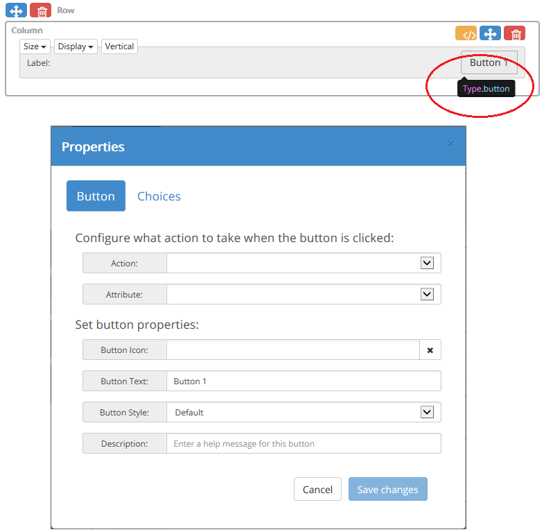
The property dialog is displayed.
Button Tab
| • | Action - configure what action to take when the button is clicked (e.g. call function, run script, show page, send business outcome); |
| • | Attribute - |
| • | Button Icon - allows a font awesome format class string to be specified. See https://fontawesome.com/v4.7.0/ for details; |
| • | Button Text - the text displayed on the button; |
| • | Button Style - allows a Bootstrap colour style to be applied to the button group. The available options are Default, Primary, Success, Info, Warning, Danger and Link; |
| • | Description - allows a message to be entered that is displayed when the cursor is hovered over the button. |
Choices Tab
This tab that allows multiple buttons to be configured through the Edit Choices dialog. From here you can:
| • | Add new button. This displays the Edit Choice editor allowing the new button name; |
| • | Edit selected button; |
| • | Delete selected; |
| • | Move selected button up; |
| • | Move selected button down. |
Actions
Select the action Call Function to call a function in the CallGuide.custom.js file when the button is clicked. A list of callable functions will appear in the Function Name dropdown.
For a function defined in the CallGuide.custom.js file to appear in the list it must have the ‘[Browsable(true)]’ attribute defined.
//[Browsable(true)]
function MyTestFunc() {
}
Select Run Script to run a CallGuide script when the button is clicked. A Script Name and the Start Prompt for the selected script must be selected.
Select Show Page to show an html page in CallGuide’s Main frame when the button is clicked. An existing CallGuide html page can be selected from the dropdown or an external web site can be typed in.
Select Send Business Outcomes to send a Business Outcomes that have been captured from Checkboxes bound to business codes when the button is clicked. This action would normally be used in Sidebar mode for a custom business outcome page.
Attributes
When hovering the mouse inside the column containing a Button, a group of Bootstrap styling attributes appear. These attributes allow the styling of the Button to be modified.
| • | Size - <Large, Default, Small, Mini> select the size of the button; |
| • | Display - <Default, Block, Pull Right> - set the CSS display property; |
| • | Vertical Toggle button - sets whether the button group should be displayed in a vertical orientation. |
The Text Area component consists of a text area element that can be sized vertically (rows) by dragging the text area drag handle vertically.
Hovering the cursor over a Text area component will display tooltip text describing the element type. To edit the properties click the tooltip text.
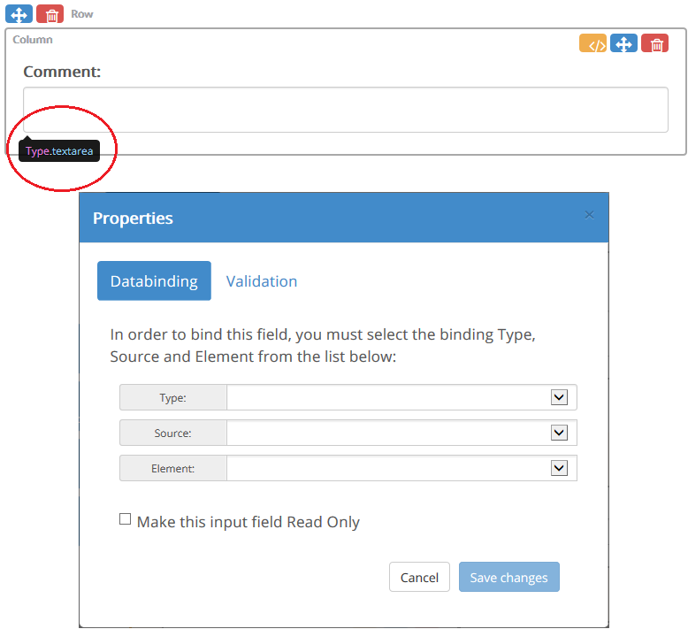
The property dialog is displayed.
Databinding Tab
| • | Type - allows the text value to be bound to a rostrvm CLIPboard element, a CallGuide Persistant data source element or to Business Outcome data. |
| • | Source - the source of the bound data (e.g. a data store name for CLIPboard binding); |
| • | Element - the name of the element (e.g. CLIPboard element name, business outcome); |
| • | Make this input field Read Only - provides the option to make this text field read only. |
Validation Tab
| • | Required - allows the field to be specified as being required. A required field must contain a value in order for a CallGuide script to move forward or to be able to navigate away from the page; |
| • | Description - allows the field hover help text to be defined. |
The Composite Input toolbox category contains multi-input elements which can be combined with a left-hand or right-hand label. This category includes a Select-Checkbox, Input-Checkbox, Select-Button and Input-Button. All the components are Bootstrap themed.
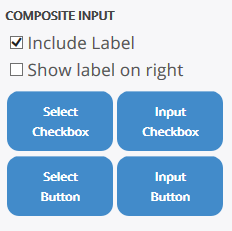
If the Include Label checkbox is selected, a left-hand label will be added to the group. Selecting Show label on the right will show the label on the right-hand side.
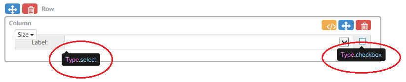
The Select-Checkbox combines a Select element and a single Checkbox element. One common use of this composite would be the selection of a rostrvm Business Outcome and data from the dropdown.
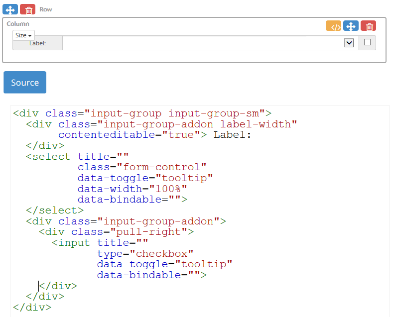
Hovering the cursor over either the Select element or the Checkbox element will display tooltip text describing the element type. To edit either of the properties click the tooltip text.
The appropriate property dialog is displayed.
| • | See Select for the property details of this element; |
| • | See Checkbox for the property details of this element. |
Attributes
When hovering the mouse inside the column containing a Select Checkbox, a group of Bootstrap styling attributes appear.
| • | Size - <Large, Default, Medium, Small> select the size of the checkbox. |
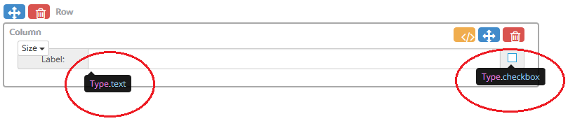
The Input-Checkbox combines an Input element and a single Checkbox element. One common use of this composite would be the selection of a rostrvm Business Outcome and the entry of outcome value.
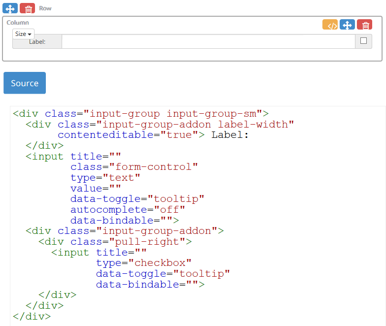
Hovering the cursor over either the Input element or the Checkbox element will display tooltip text describing the element type. To edit the appropriate properties click the tooltip text.
The appropriate property dialog is displayed.
| • | See Input for the property details of this element; |
| • | See Checkbox for the property details of this element. |
Attributes
When hovering the mouse inside the column containing a Select checkbox, a group of Bootstrap styling attributes appear.
| • | Size - <Large, Default, Medium, Small> select the size of the checkbox. |
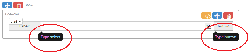
The Select-Button combines a Select element and a single Button element.
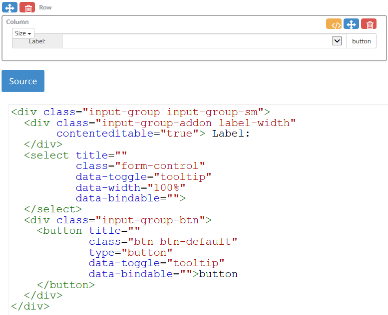
Properties
Hovering the cursor over either the Select element or the Button element will display tooltip text describing the element type. To edit the appropriate properties click the tooltip text.
The appropriate property dialog is displayed.
| • | See Select for the property details of this element; |
| • | See Button for the property details of this element. |
Attributes
When hovering the mouse inside the column containing a Select Checkbox, a group of Bootstrap styling attributes appear.
| • | Size - <Large, Default, Medium, Small> select the size of the checkbox. |
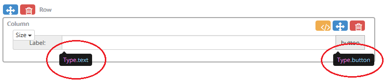
The Input-Button combines an Input element and a single Button element.
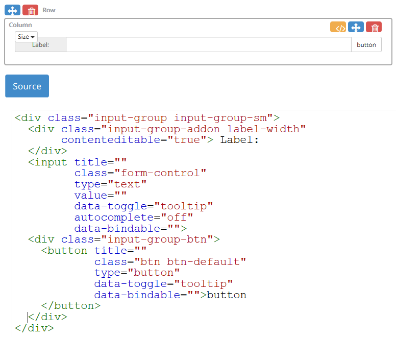
Properties
Hovering the cursor over either the Input element or the Button element will display tooltip text describing the element type. To edit the appropriate properties click the tooltip text.
The appropriate property dialog is displayed.
| • | See Input for the property details of this element; |
| • | See Button for the property details of this element. |
Attributes
When hovering the mouse inside the column containing a Select Checkbox, a group of Bootstrap styling attributes appear.
| • | Size - <Large, Default, Medium, Small> select the size of the checkbox. |